A nine-post picture can look complete in a design file and broken on a profile. The usual problems are simple: the image was cut around a face or headline, the pieces went up in the wrong order, or each tile looked meaningless by itself.
Use this guide to make a small profile grid deliberately. You will choose the right format, preview the cut, and publish the pieces in sequence. A grid is a temporary arrangement of separate posts, so design for the person who sees only one piece too.
01
Decide whether the picture belongs on your profile or in one post
A profile grid splits one image into three, six, or nine separate posts. Someone opening your profile can see the assembled picture across three columns. Someone who encounters a single tile in the feed sees only that tile.
A carousel keeps the sequence inside one post. Choose it for a tutorial, before-and-after story, or product explanation that needs to be read in order. Sidefold’s free grid maker has both modes, but they solve different reading problems. If a single tile cannot stand on its own, a carousel is often the better choice.
Profile impact over several posts: choose a grid.
A sequence readers should swipe through: choose a carousel.
One useful idea with no sequence: publish one clear image.
02
Make the source image before you cut it
Start with an image you own or have permission to publish. Place the main subject inside a tile, not across the line between two tiles. Keep important words away from cut lines. If the full image contains a call to action, repeat its meaning in the captions because a feed viewer may never see the assembled version.
For a three-column grid, each exported tile is 1080 × 1440 pixels in Sidefold’s current tool. A source image with at least 3240 pixels across gives each column enough source width for that export; a smaller source may be enlarged and look soft. Inspect the preview at phone size before downloading. Check Instagram’s photo-resolution guidance for the platform’s current upload requirements rather than assuming one export setting will always display identically.
03
Split the image and inspect every cut
- Open the Instagram grid maker and select Profile grid.
- Upload a JPG, PNG, or WebP image under 25 MB. The tool processes the image in your browser.
- Choose 3×1, 3×2, or 3×3. Start with three posts if you are unsure whether a larger arrangement is worth the publishing effort.
- Review the assembled preview and the numbered tiles. If a cut ruins a face, a title, or a product detail, change the source image or its composition and preview again.
- Download all tiles as PNGs, or download a tile individually if you need to replace one.
The tool’s preview shows where it will cut your source image. It does not guarantee how Instagram will crop the post in every surface, so keep the source file and make a final check in the Instagram app.
04
Publish from the bottom right to the top left
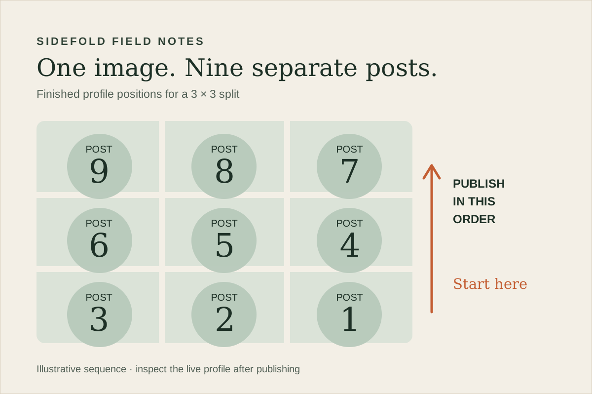
When a profile shows the newest post first, the last tile you publish takes the top-left position. For a 3×3 grid, post tile 1 from the bottom right first. Continue left across that row, then move up. Post tile 9 from the top left last. The diagram above labels where each numbered file should finish on the profile.
| Finished profile row | Left | Middle | Right |
|---|---|---|---|
| Top | Post 9, published last | Post 8 | Post 7 |
| Middle | Post 6 | Post 5 | Post 4 |
| Bottom | Post 3 | Post 2 | Post 1, published first |
Sidefold’s downloaded grid files are numbered in posting order. Keep those filenames until the batch is live. Publish one tile, confirm its position, then continue. If you use Instagram’s native scheduling for a professional account, check its current scheduling guidance and verify the scheduled order before relying on it.
05
Check the actual profile on a phone
After the final tile is live, open the profile as a visitor would. Look for mismatched edges, unexpected crops, and a row shifted by another post. Open the individual tiles too: the profile thumbnail and the full post are different viewing contexts. If Instagram’s current interface offers preview adjustments for your post, review them there; do not assume the splitter can control that display.
For a launch, leave enough time to correct a mistake before announcing the finished profile. A new post or a pinned item can move the arrangement. If the image must remain intact for a campaign, use a carousel or a permanent page as the main destination, and treat the profile grid as a short-lived display.
06
Give each tile a reason to exist
Do not write nine identical captions that say only “visit my profile.” A fashion creator can use one tile to explain fabric, another to show fit, and another to answer a sizing question. A writer can use each piece to introduce a distinct idea from a new guide. The combined picture gets attention; the individual posts have to deliver something useful.
When a tile points to a product or resource, label the destination clearly and test the link. Sidefold’s link-in-bio guide shows how to match a post’s promise to its destination. If the content recommends affiliate products, our affiliate-link guide covers clear disclosures and link checks.
07
Common questions
Which tile do I publish first for a 3×3 grid?
Publish the bottom-right tile first, then work right to left across the bottom row. Continue with the middle row and finish with the top-left tile. Sidefold names the downloaded PNGs in that posting order.
Will a nine-post picture stay together on my profile?
Only while those nine posts occupy the expected positions. New posts, pinned posts, or a different profile layout can change the assembled view. Check the live profile after publishing and avoid putting essential words across tile boundaries.
Should I use a grid or a carousel?
Use a profile grid when the combined profile view is the point and you can publish several posts together. Use a carousel when the sequence should stay together as one post that people can swipe through.
Try a three-post version first.
Choose one image, preview its cuts, and make sure each piece still says something on its own.